
Choosing the right Vastu colors for home can play a crucial role in balancing energies and creating a harmonious living space. According to Vastu Shastra, the ancient Indian science of architecture, colors have a profound impact on our emotions, well-being, and overall energy within the home. Whether you are painting walls or decorating rooms, selecting the right colors can enhance positivity, peace, and prosperity. Here’s how to select the right Vastu colors for home to create a balanced and happy environment.
Table of Contents
1. Understanding the Importance of Directions
In Vastu Shastra, the direction of each room plays a vital role in determining the right Vastu colors for home. Each direction is associated with a specific element and energy, and the colors you choose should align with these elements. For example, the north is linked to water, so shades of blue, green, and black are ideal for rooms facing this direction. Similarly, the south, associated with fire, benefits from warm tones like red, orange, and pink. Understanding the elements associated with each direction helps in selecting colors that harmonize with the natural energies.
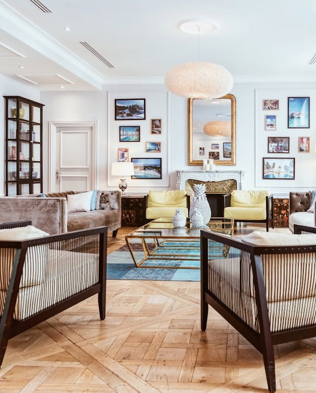
2. Vastu Colors for the Living Room
The living room is a space for socializing and relaxation, so choosing the right Vastu colors for home is essential to maintaining a welcoming atmosphere. Light shades of yellow, cream, or beige are perfect for living rooms as they promote warmth and comfort. These colors create a calming effect and encourage positivity. Additionally, green can be used to promote harmony and balance, as it is associated with growth and vitality.

3. Ideal Colors for Bedrooms
Selecting the right Vastu colors for home is particularly important for bedrooms, where relaxation and tranquility are key. Soft shades of blue, green, or lavender are ideal for creating a peaceful and restful environment. These colors promote calmness and emotional well-being. Avoid using bright or intense colors like red or orange in the bedroom, as they are too stimulating and may disturb sleep. Instead, opt for soothing tones that encourage relaxation.
4. Right Vastu Colors For Home: Kitchen
In Vastu Shastra, the kitchen represents the fire element, making it essential to choose colors that complement this energy. The right Vastu colors for home kitchens include shades of red, orange, and pink, which align with the fire element. However, if you prefer a more neutral palette, earthy tones like light brown, beige, or cream can also create a balanced environment. Avoid using dark or dull colors in the kitchen, as they can dampen the energetic flow of this vital space.
5. Bathroom Colors According to Vastu
Bathrooms are associated with water, and selecting the right Vastu colors for home bathrooms is important to ensure proper energy flow. Light blue, white, and pastel shades are ideal for bathrooms, promoting cleanliness and freshness. These colors help create a serene and balanced atmosphere in a space often associated with purification.
Conclusion
Selecting the right Vastu colors for home is an effective way to improve the energy flow and create a harmonious living environment. By understanding the impact of colors and their alignment with the elements of each direction, you can choose shades that promote positivity, peace, and prosperity. Whether it’s the living room, bedroom, kitchen, or bathroom, using Vastu-approved colors ensures that your home remains a balanced and peaceful sanctuary for everyone living in it.
[Read 5 Vastu Tips For Temple At Home]
FAQs
Can Vastu colors impact family health and well-being?
Yes, Vastu colors can influence mood, energy levels, and overall well-being by harmonizing the environment according to specific energy needs.
How do Vastu colors vary by home direction?
Northeast: light blue; Southeast: orange or red; Northwest: white; Southwest: peach or earth tones; East: white or light blue; West: blue or white.
Is black considered bad in Vastu?
In Vastu, black is often considered inauspicious and recommended to be used sparingly, as it can attract negative energy if overused in home interiors.